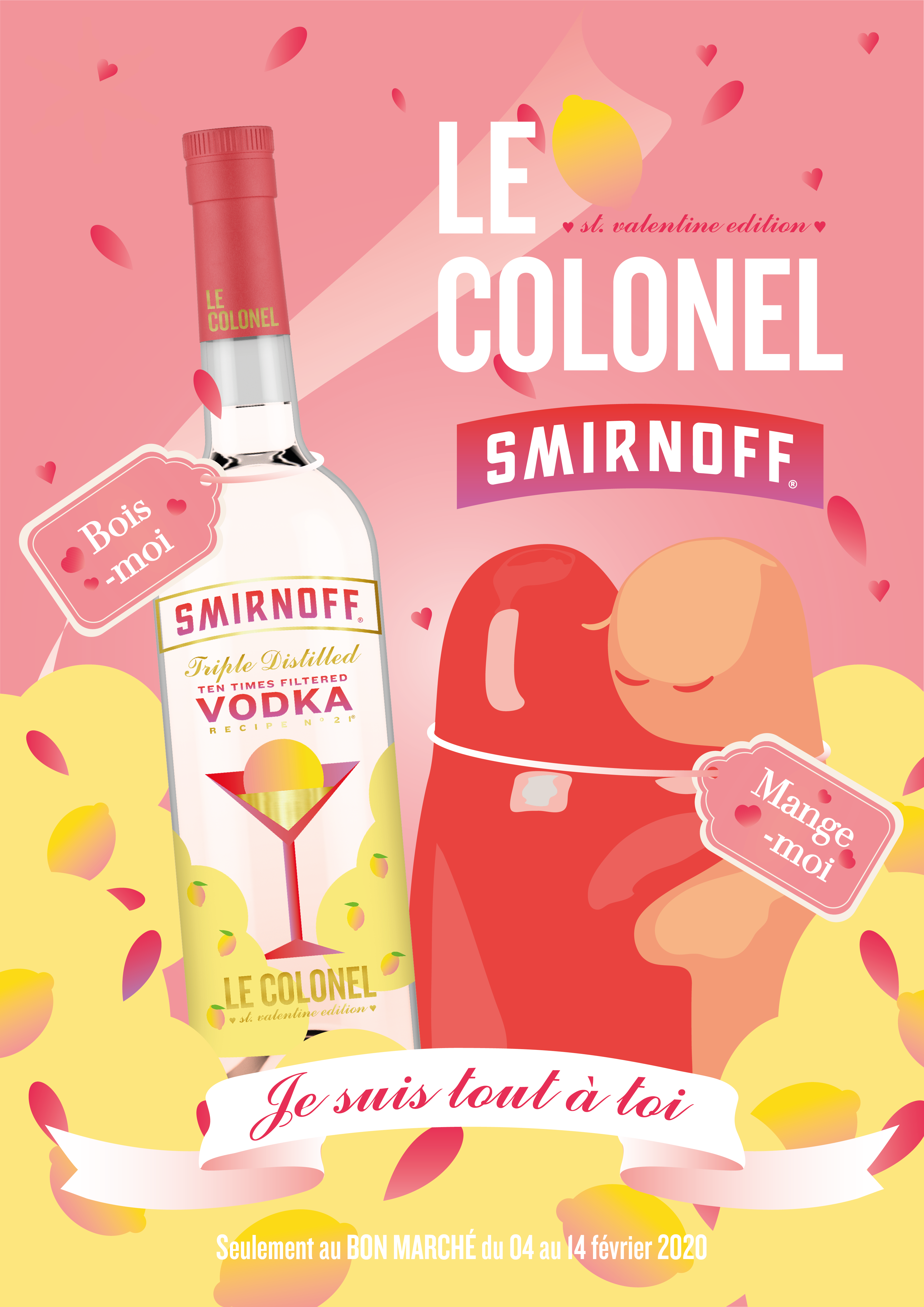
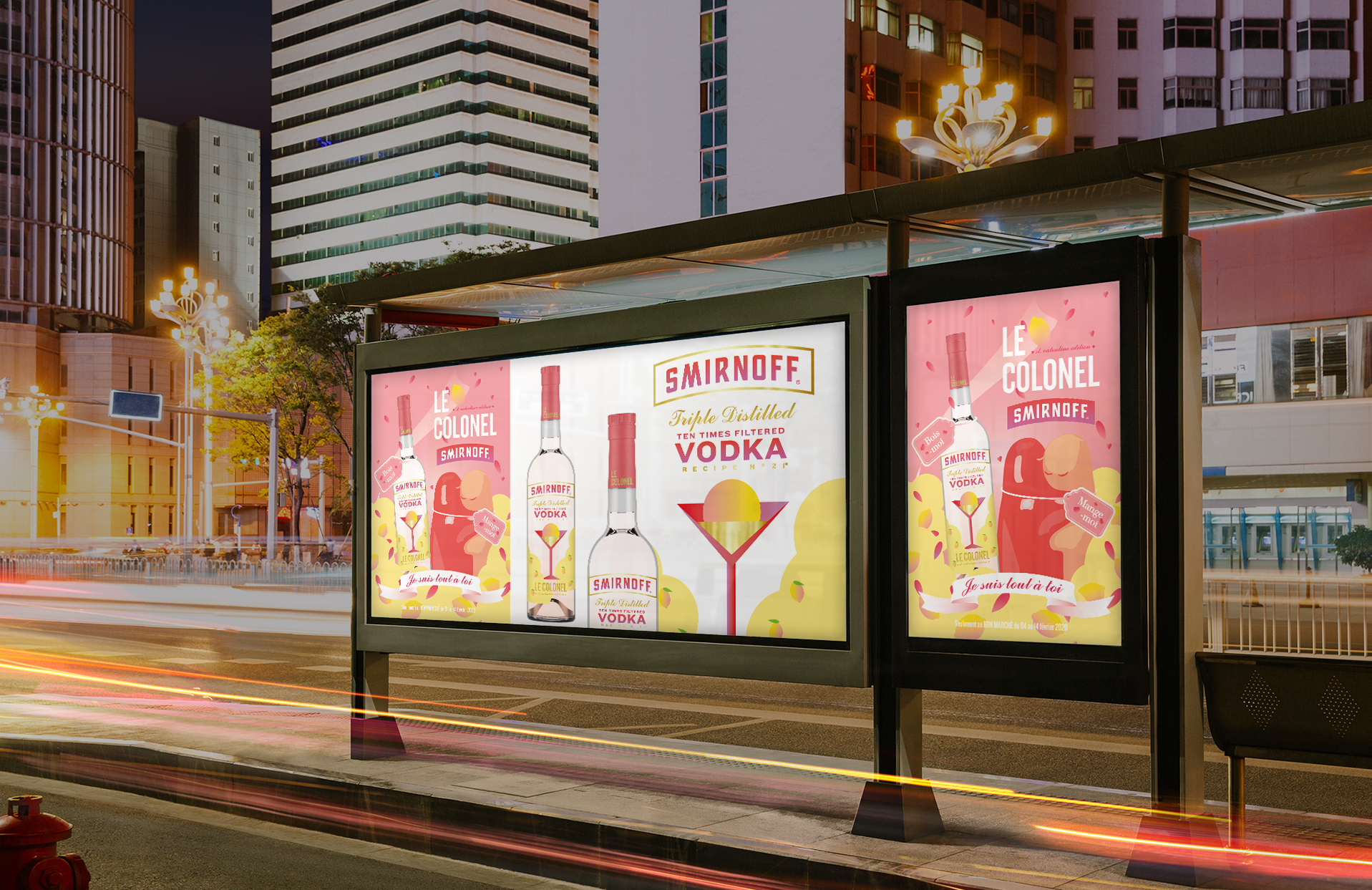
Smirnoff Le colonel ___2020
We worked on a project to plan and advertise Valentine's day special edition, which allows people to make a colonel for vodka 'Smirnoff.' We applied a romantic design to the Smirnoff's bottle that implies lemon and colonels with pink, yellow, and gold color palette. We designed a label inspired by Alice in Wonderland, and a barrel for Colonel's ingredient, lemon sorbet, based on the shape of the pepper canisters that the lover is hugging each other. Using the catchphrase 'Eat me, Drink me, I'm all yours', we designed a poster to promote our Valentine's special edition.
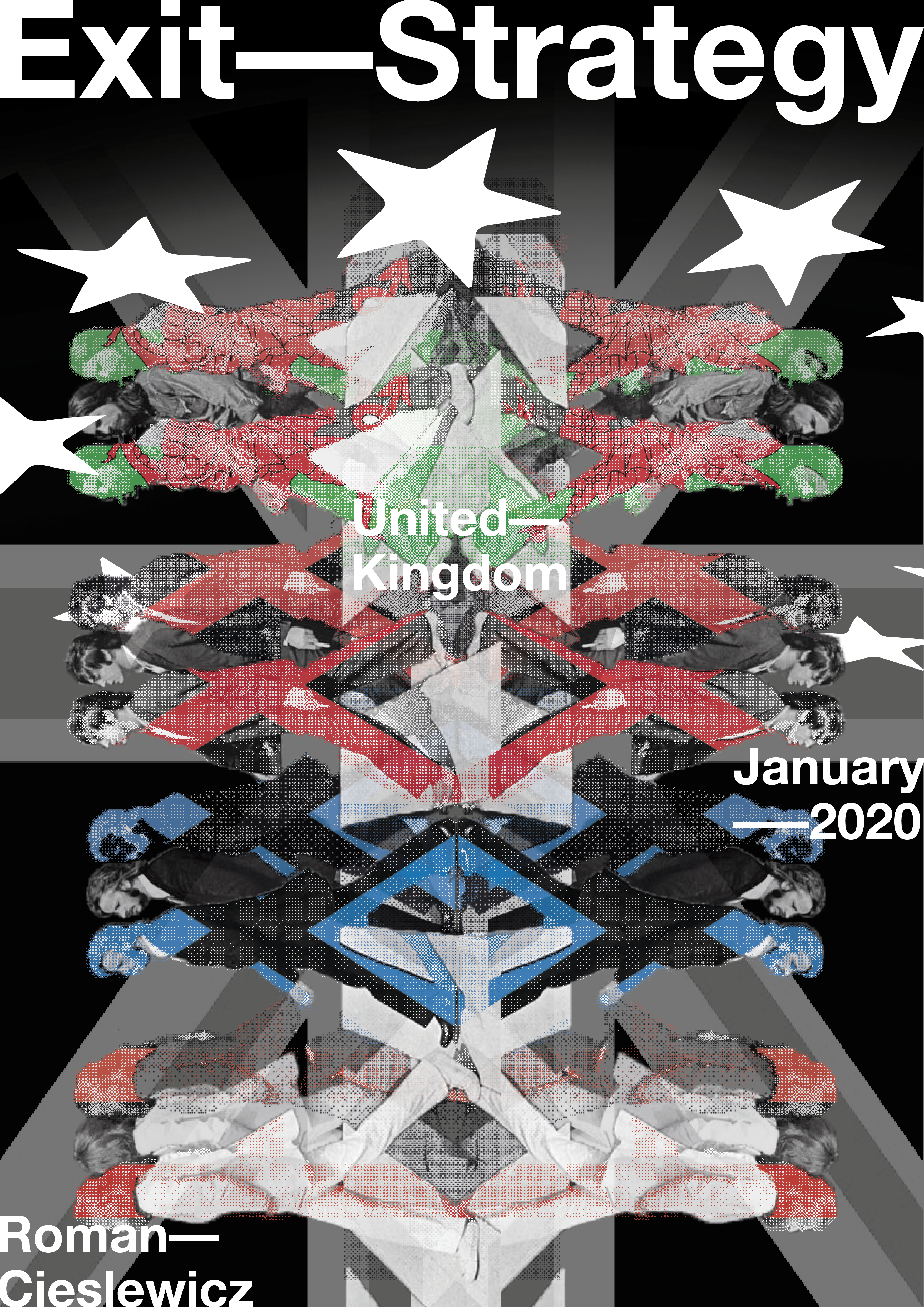
Exit Strategy ___2020
It was a project designing a poster as an homage of Roman Cieslewicz. I researches about him and knew that he was always making artworks with social topic and tried to use trendy design method of that era. I thought the Brexit was good for the topic so I made a poster using many metaphors (beatles, Union Jack, EU) and trendy swiss design.
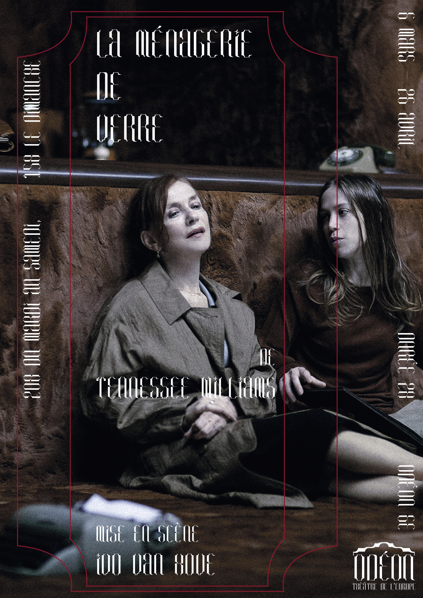
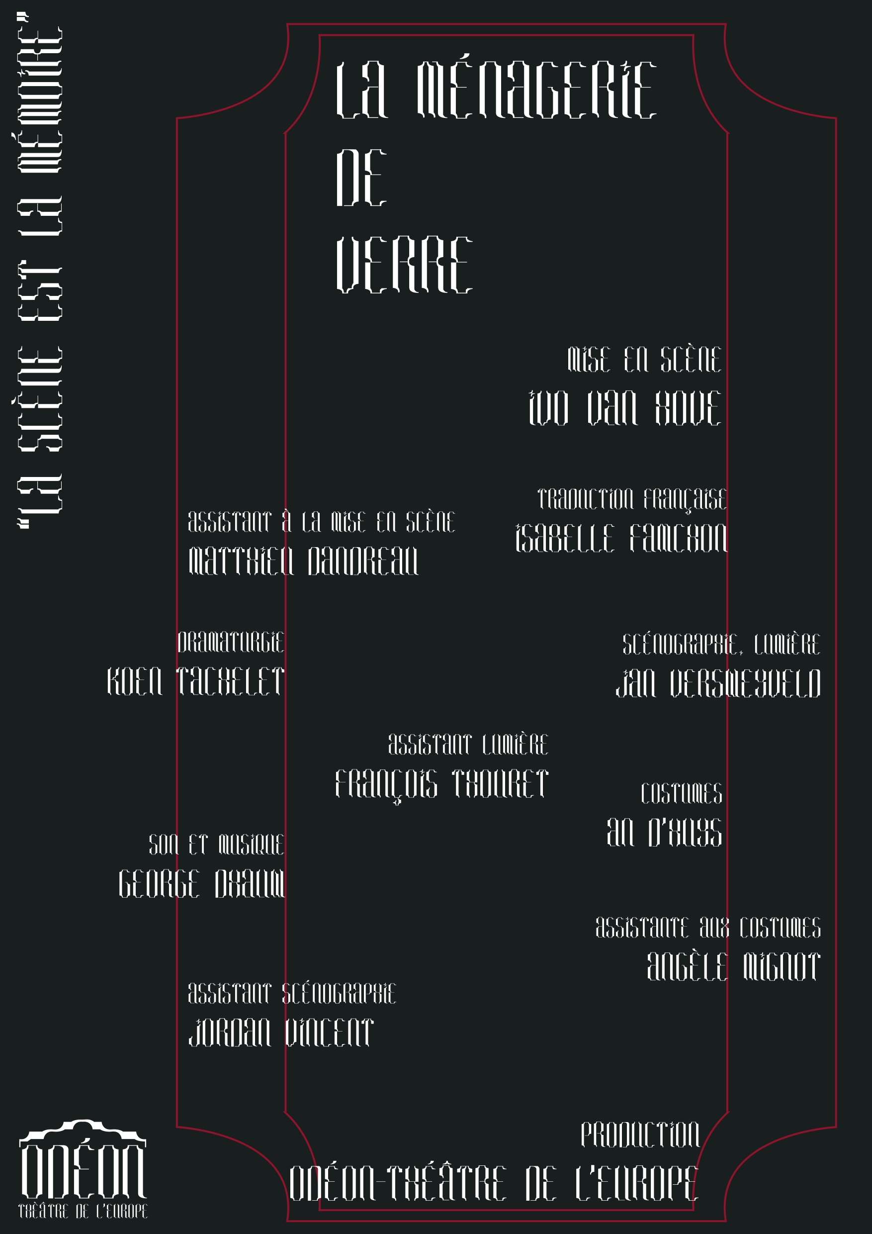
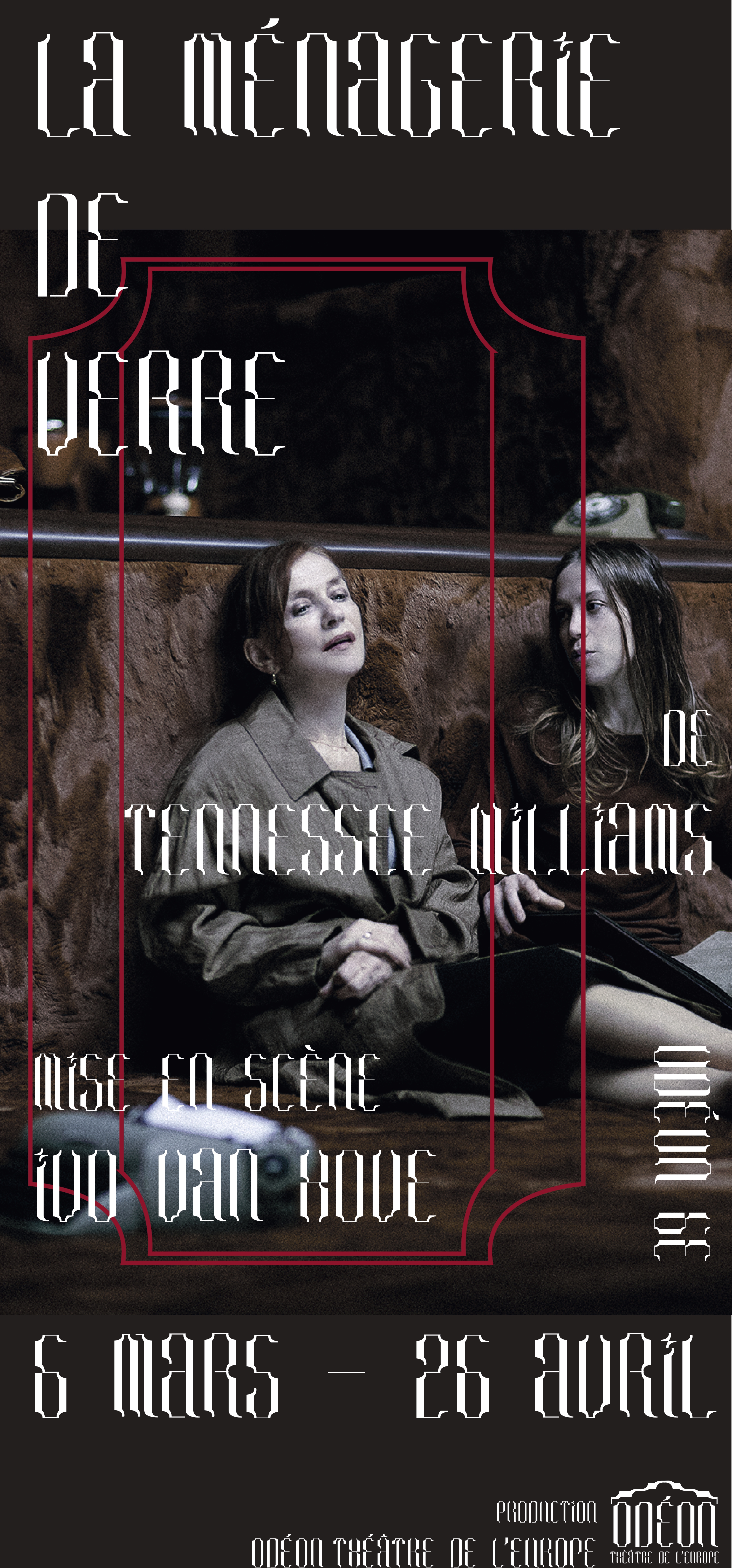
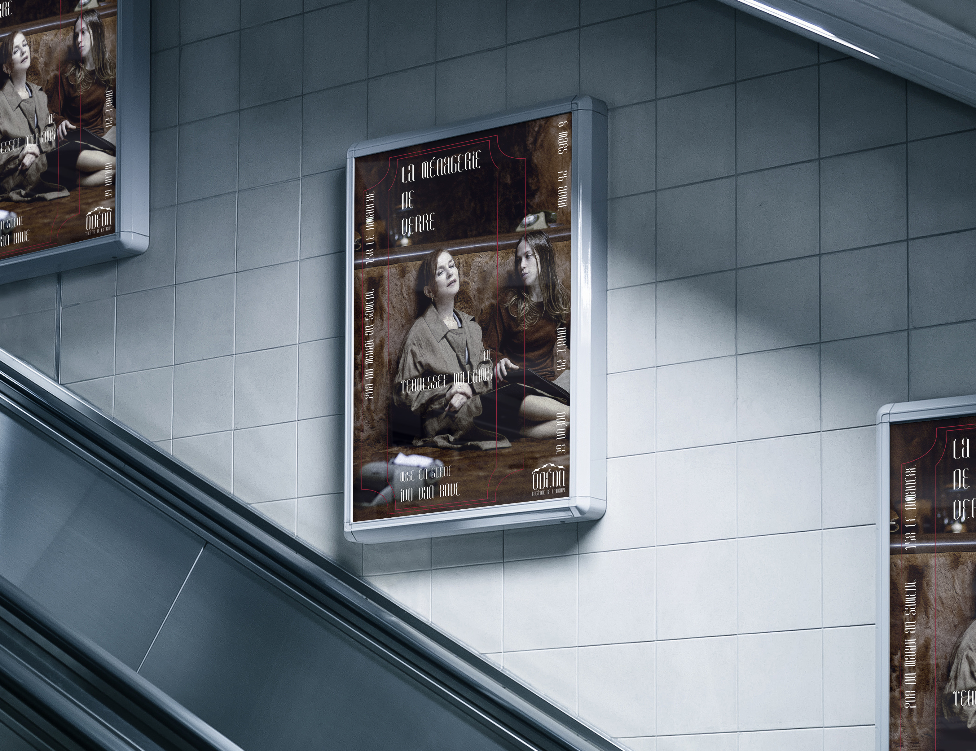
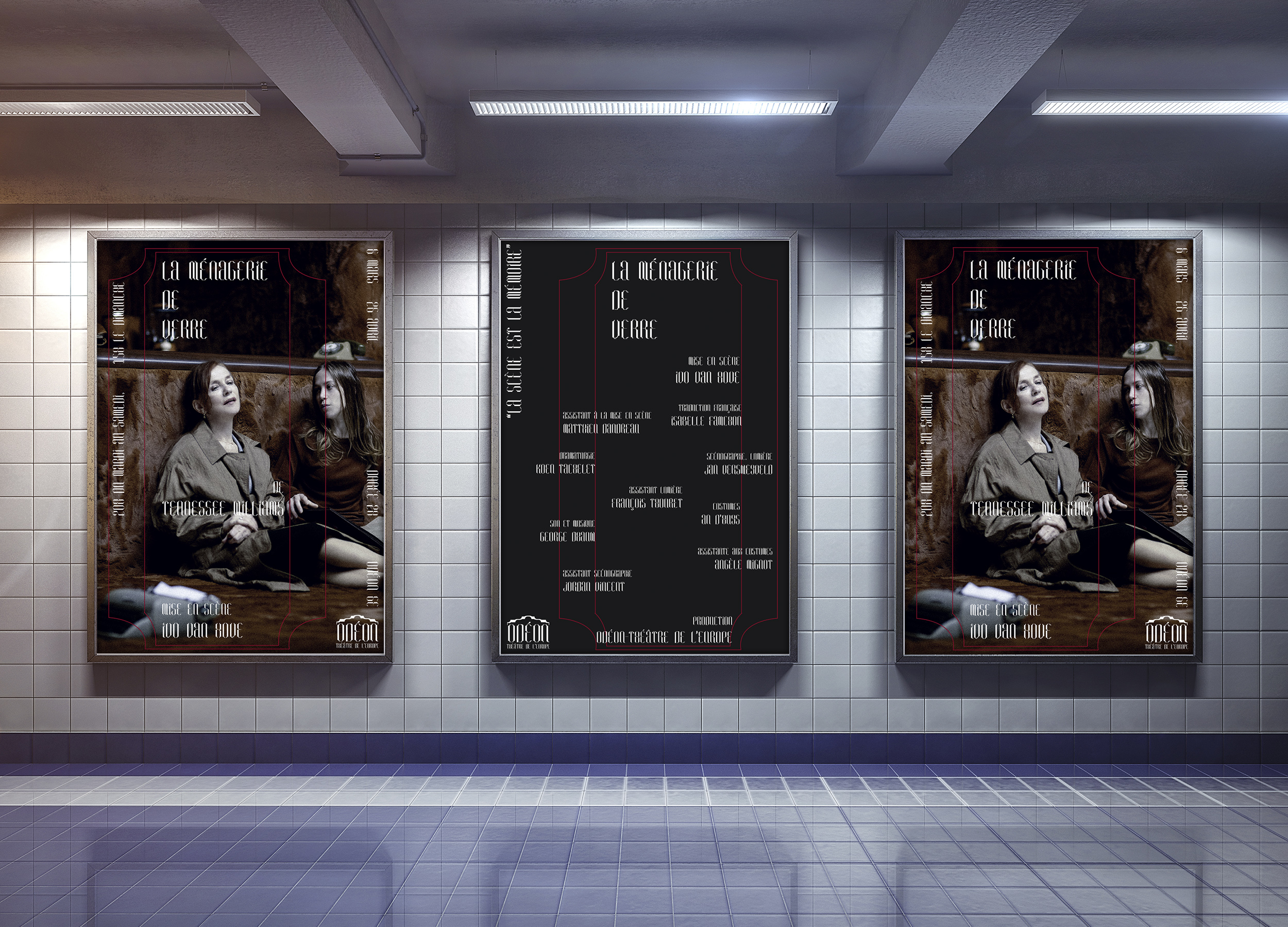
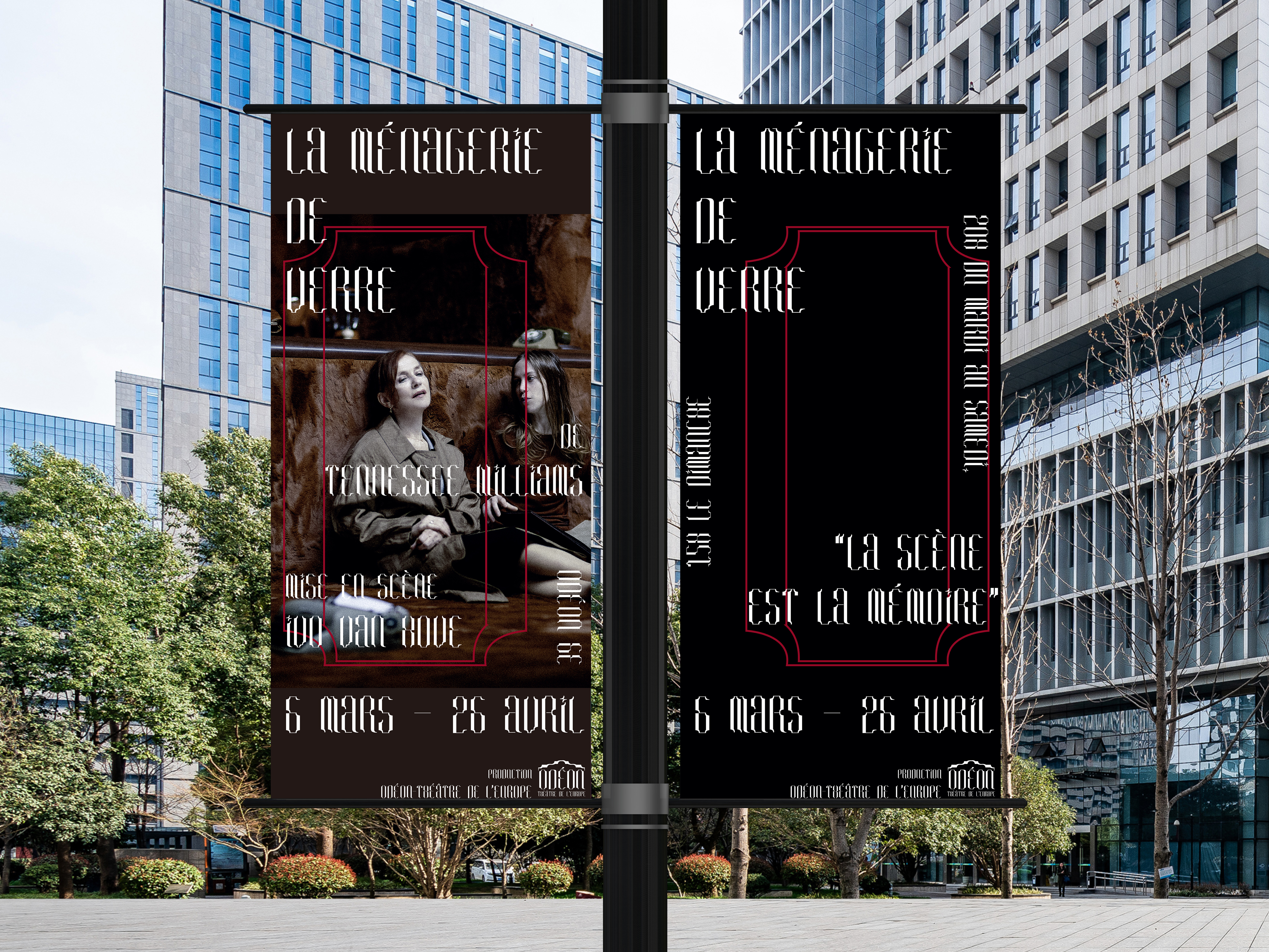
Théâtre de l’Odéon Rebranding___2020
I designed fonts, logos, pictograms, tickets, poster templates, and banners templates for rebranding the Odéon Theater. Thinking that Odéon Theater's most distinctive strength is its long history, it designed Roman typefaces based on the motif of the columns at the front of the Odéon Theater. Using the font, the company designed a logo that embodies the shape of the Odéon Theater, and produced pictograms and signboards of toilets, ticket booths and exits to fit in it. In addition, I thought that the 'o' shape that stands out among the logos could emphasize identity of my branding, so I created and presented a poster and banner template of the Odéon Theater that can be used repeatedly.